Exposures should be fool-proof with digital photography, as photographers can rely both on the analog display of their exposure meter and the LCD view of the image's histogram. For the record, Mary and I use spot-metering and manual mode to make our exposures. Usually, we do not rely upon the histogram to check our exposures, although on occasion, to make sure we're not clipping highlights, we'll check. In the field we've observed too many photographers wasting too much time checking their histograms after every shot when, indeed, if the exposure was done correctly the histogram should be fine. Surprisingly, at our Digital Complete Nature Photo Course, the primary concern of most photographers is still exposure -- getting it right without having to resort to the histogram.
Make no mistake, the histogram display is a great thing, but it should not be used as a crutch. If your exposures are accurate your histogram display should be fine, and you really shouldn't need to check it. However, in areas of high contrast, or with questionable exposures, the histogram is invaluable. Further, the histogram is a better representation of your image than is the actual LCD image, since the display may be darker or lighter than the 'real' image, depending upon the brightness of the screen. Also, the histogram may be easier to see, and easier to interpret, in bright light when an actual image display might be almost invisible. Both displays -- image or histogram -- are based upon in-camera processing, and essentially match a jpeg-style image. RAW images and their histograms are converted in-camera and do not necessarily reflect the full, broader range of the actual RAW data. That's a good thing, as you'll probably have more range in your RAW histogram than the camera's LCD indicates.
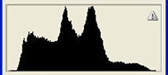
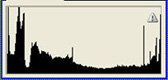
At any rate, there is no perfect histogram, and each image has its own unique graph. Some histograms can be 'bad', in that the resulting image may be a lousy exposure, but that's a reflection of the image, not of the histogram itself. The following histograms are all of technically good images, yet the histograms differ greatly. Can you match them?
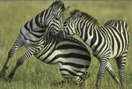
All of the images were shot on the second safari of our Kenya Photo Safari in late November-early December 2004. The wildlife images were shot with a 1D Mark II, the scenics with a 1Ds. The portfolio is equally represented by Mary and I -- three shots each. For more images from the trip, see our Kenya Trip Report or the Kenya Safari Participants' Portfolio.
Challenged? These were some interesting histograms! In every case the RAW exposures were fine, although I'd do a bit of exposure 'tweaking' on the falcon, and a Curves RAW adjustment with the bright sun to bring it down to a white a bit lower than 255. Below is an analysis of each:
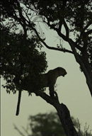
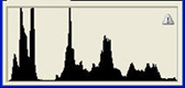
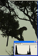 The
leopard silhouette is peaked at two levels -- the slightly brighter
than middle tone sky and the silhouettte. Using Levels, we could
increase the contrast even further. You can see the difference
in contrast.The histogram would then be spiked on both ends, reflecting
clipping on both ends:
The
leopard silhouette is peaked at two levels -- the slightly brighter
than middle tone sky and the silhouettte. Using Levels, we could
increase the contrast even further. You can see the difference
in contrast.The histogram would then be spiked on both ends, reflecting
clipping on both ends:
![]()
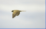
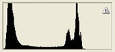
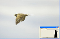 The
falcon histogram is shifted way to the right, and again, in a
RAW conversion, the exposure could be shifted to slightly underexpose
this original, uncorrected RAW image.
The
falcon histogram is shifted way to the right, and again, in a
RAW conversion, the exposure could be shifted to slightly underexpose
this original, uncorrected RAW image.
 I
was a bit surprised at this histogram, because I actually expected
the black to be clipped. As you can see, it is not. To increase
the contrast, in a finished image I would probably adjust the
black slider in Levels to come just a bit closer to the black
data, and probably do the same with the white slider-- spreading
out the contrast a bit more.
I
was a bit surprised at this histogram, because I actually expected
the black to be clipped. As you can see, it is not. To increase
the contrast, in a finished image I would probably adjust the
black slider in Levels to come just a bit closer to the black
data, and probably do the same with the white slider-- spreading
out the contrast a bit more.
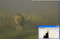 This
was an interesting one, because the in-camera histogram was an
even more narrow, spiked graph --- essentially it looked like
one bar of a bar graph, with all the values in that one area.
In Photoshop a broader set of values are shown -- a more accurate
treatment, really, but seeing the original in-camera histogram
clearly showed me how the camera's histogram can be a bit misleading.
It will be accurate enough to determine an exposure, but it may
not reflect the full range of values. Question is, does that even
matter?
This
was an interesting one, because the in-camera histogram was an
even more narrow, spiked graph --- essentially it looked like
one bar of a bar graph, with all the values in that one area.
In Photoshop a broader set of values are shown -- a more accurate
treatment, really, but seeing the original in-camera histogram
clearly showed me how the camera's histogram can be a bit misleading.
It will be accurate enough to determine an exposure, but it may
not reflect the full range of values. Question is, does that even
matter?
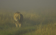
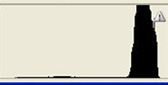
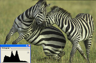 This
should have been the easiest of the images to match. A broad range
of values without any clipping on either end. This is an unadjusted
jpeg straight from a no-frills RAW conversion. Everyone should
have guessed this one correctly.
This
should have been the easiest of the images to match. A broad range
of values without any clipping on either end. This is an unadjusted
jpeg straight from a no-frills RAW conversion. Everyone should
have guessed this one correctly.
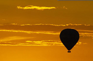
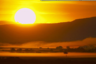
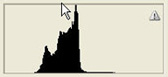
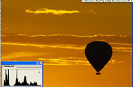
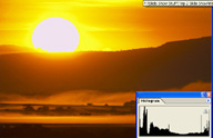 This
histogram is spiked at both ends. It should be obvious on the
white end -- the sun is burned out, but the foreground black is
clipped as well. That's OK -- at the black end, and a Curves adjustment
on the light end, for the sun, would reduce the too-bright look
to the sun. Adding a hint of color to the sun in Photoshop would
also enhance this image.
This
histogram is spiked at both ends. It should be obvious on the
white end -- the sun is burned out, but the foreground black is
clipped as well. That's OK -- at the black end, and a Curves adjustment
on the light end, for the sun, would reduce the too-bright look
to the sun. Adding a hint of color to the sun in Photoshop would
also enhance this image.
Don't worry if you didn't get all of these histograms correct. My point is to simply illustrate that there is no perfect histogram, that you may get clipping at one, or both ends in a 'good' exposure, and that a given histogram might be 'spikey' at one end, two ends, or in several spots.
We explore the mystery of histograms, and the importance of spot-metering, manual mode exposure, in our Digital Complete Nature Photo Courses.
|
|
|
|
Flash-Remotes |
|
NANPA |